• Mountain-Themed Living Room Ideas That Feel Elevated, Not Kitschy

    Mountain-inspired interiors have become one of the most searched home decor aesthetics — and one of the most frequently misexecuted. The difference between a mountain-themed living room that feels genuinely elevated and one that tips into kitsch is narrower than most people think, and it comes down to a few specific decisions.

    The rooms that work — the ones you see in shelter magazines, in Architectural Digest features on mountain retreats, in the interiors of well-designed ski chalets — share a set of qualities: warmth without heaviness, organic materials without rustic cliché, and an art sensibility that references the landscape without depicting it literally.

    Here’s the framework.

    What Mountain Interiors Get Wrong

    The most common mistake in mountain-themed rooms is literalness. Antler chandeliers. Bear figurines. Throw pillows printed with pine trees. These choices announce the theme loudly without contributing anything to the room’s actual quality. The result feels like a reference to a cabin rather than a cabin.

    The rooms that succeed communicate the mountain aesthetic through materials, palette, and dimensional art rather than printed motifs. The feeling of warmth, groundedness, and connection to the natural world — the qualities that make mountain interiors compelling — comes from how the room is built, not from what’s depicted on it.

    The Palette

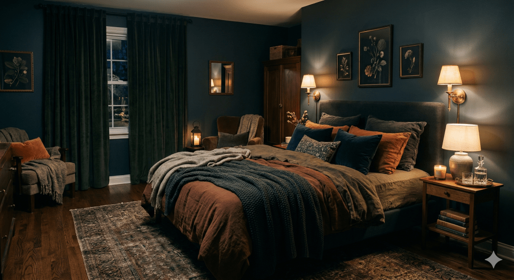
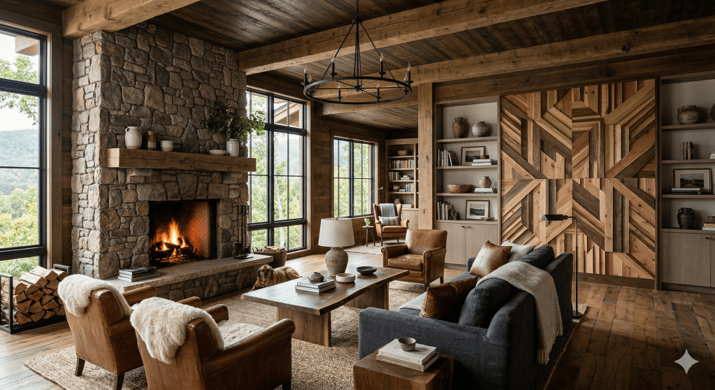
    Warm neutrals are the foundation: cream, warm ivory, camel, and oatmeal for the soft surfaces; walnut, oak, and weathered wood for the hard ones. Add deep, grounding colors as accents — forest green, deep burgundy, warm brown, slate. The palette should feel like the landscape: organic, layered, warm in tone rather than stark or cold.

    Avoid: Bright blue “sky” accents, white-and-gray Scandi minimalism (it reads cold in mountain contexts), matching furniture sets in any material.

    The Materials

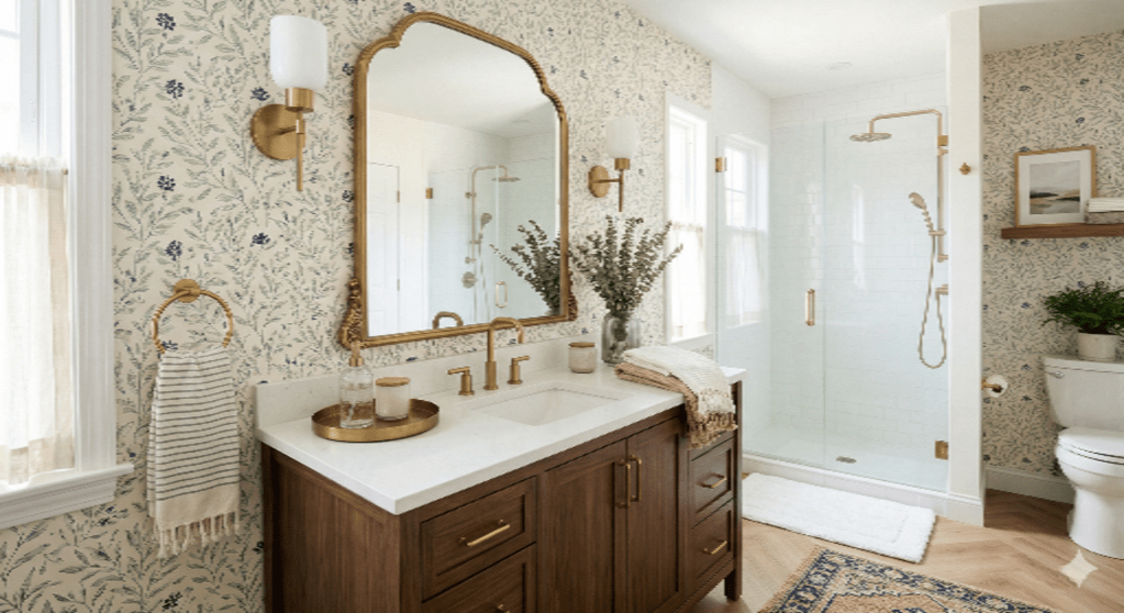
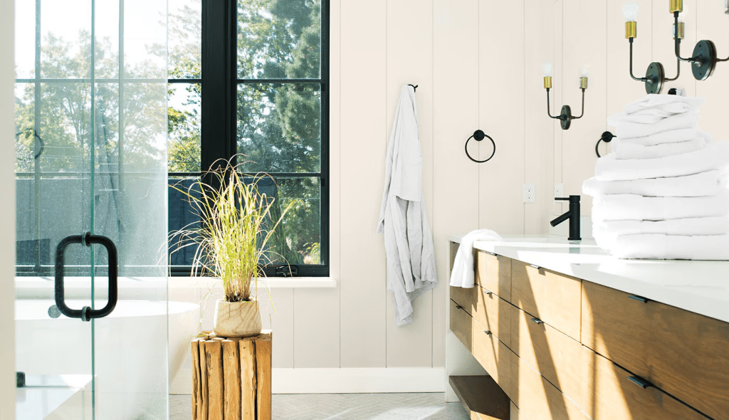
    Natural materials do the heavy lifting in mountain interiors. Solid wood — in warm tones rather than pale Scandinavian finishes — is the most important surface decision. Wool, linen, and bouclé for textiles. Leather in warm brown or caramel as an accent. Stone or concrete where architectural conditions allow.

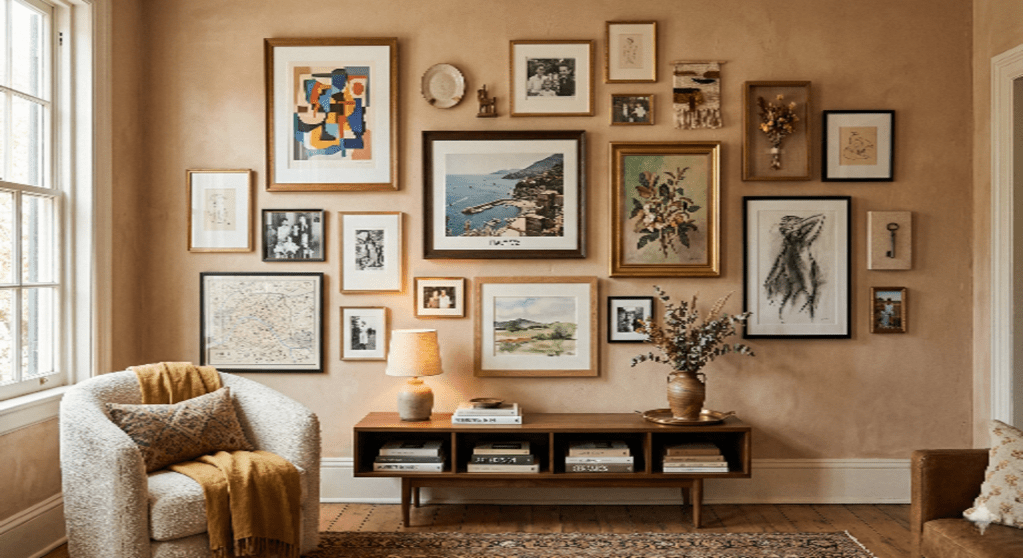
    The layering principle applies: a mountain living room should feel accumulated rather than purchased. Vintage pieces, handmade objects, and materials that have developed patina sit together in a way that new, matched furniture can’t replicate.

    The Art

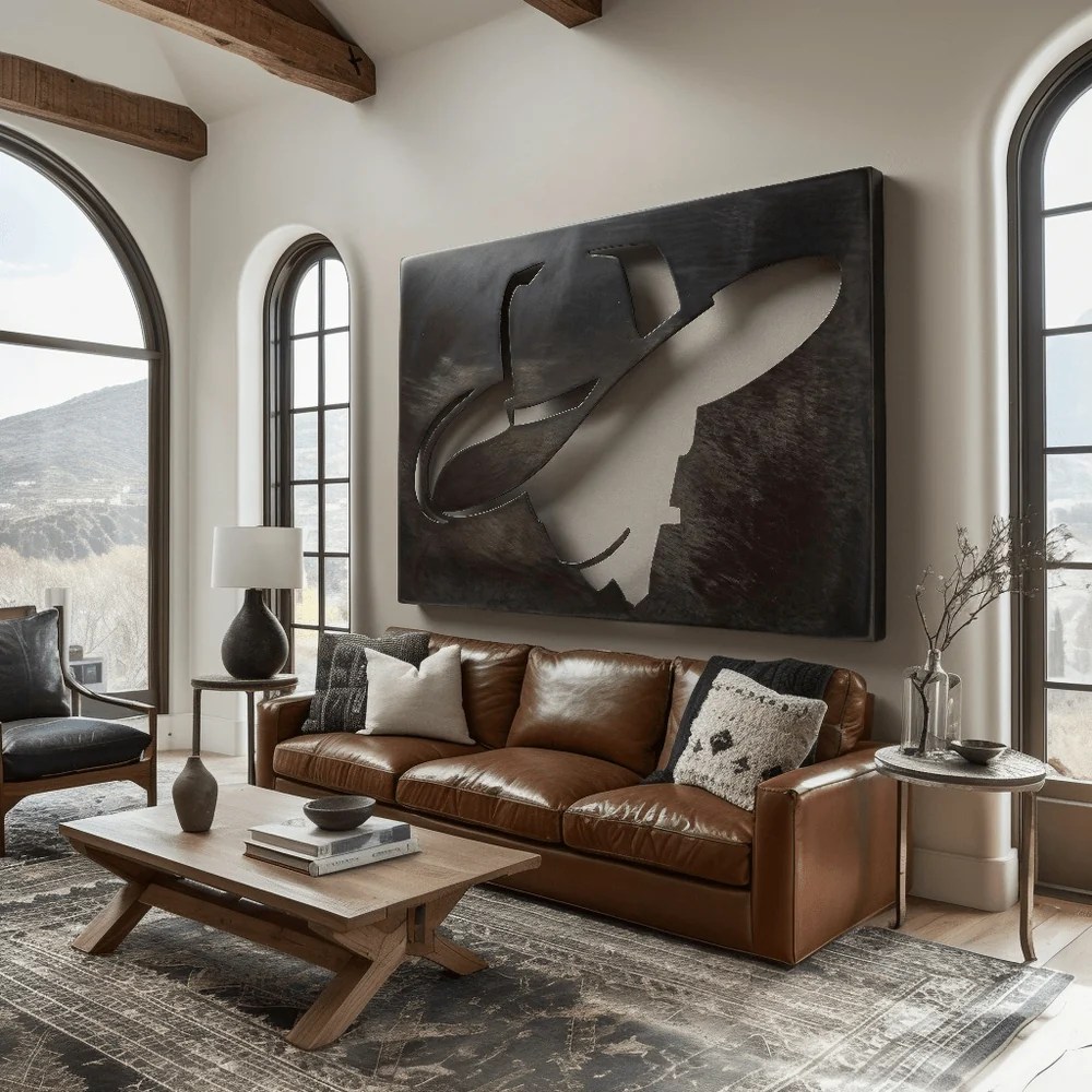
    This is where mountain interiors most consistently fall short. The typical solution — a canvas landscape print, a framed ski poster, photography of mountain ranges — communicates the right subject matter with flat execution.

    Dimensional metal wall art is the most effective alternative. Anthem Classic‘s hand-welded steel pieces specifically were designed for this application: mountain landscapes, rendered in solid 14-gauge American steel with a warm patina, made to order in the Ozarks. The result is art that doesn’t just depict the landscape — it has the weight and presence of something that belongs in a serious room.

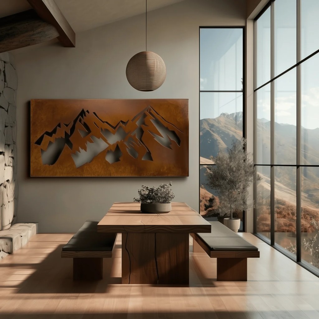
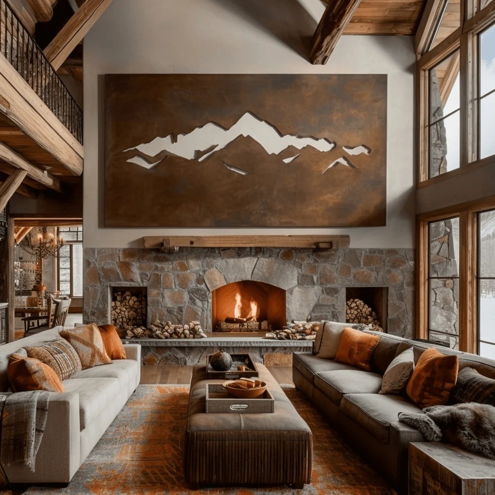
    THE GRAND TETON (from $615)
    The wide, layered mountain range composition is the most versatile option for living rooms. The horizontal format suits the wall above a sofa, above a fireplace mantle, or on a wide entry wall. The patinated steel reads warm and dimensional under any light.

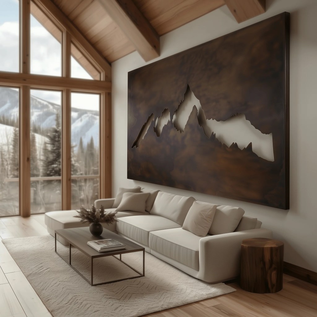
    THE CRESTFALL (from $635)
    More tension and drama — a jagged ridgeline with sharper angles and a more vertical sense of altitude. Works in rooms with darker walls and more maximalist layering. One reviewer described it as “massive in size and presence — it immediately became the focal point of the room.”

    THE WRANGLER (from $635)
    A more Western-influenced piece in the collection — suited to mountain rooms with a ranch or high-desert adjacency rather than a pure alpine sensibility.

    THE WESTERN ASCENT
    A wider, more expansive composition for rooms with significant horizontal wall space.

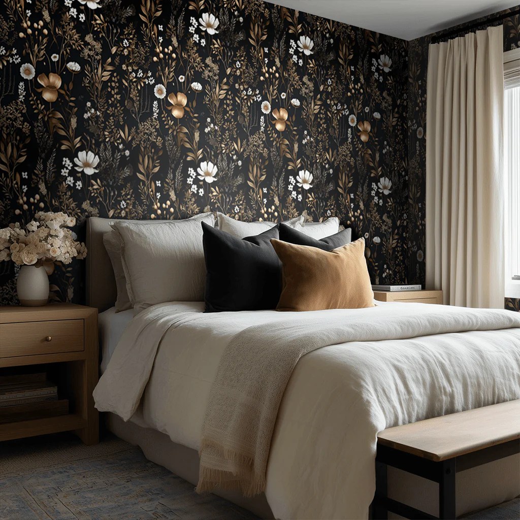
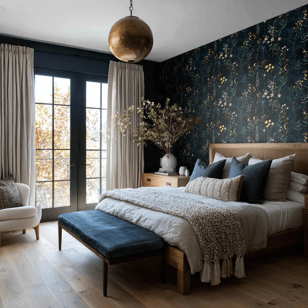
    The Wallpaper Decision

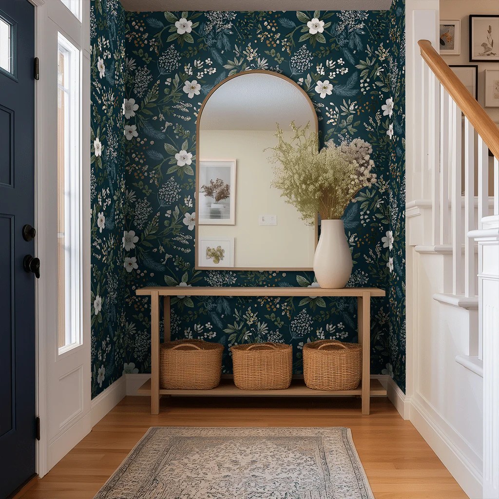
    For mountain living rooms where the walls need more texture and warmth than paint can provide, botanical and organic wallpapers in warm neutral grounds work well as a backdrop.

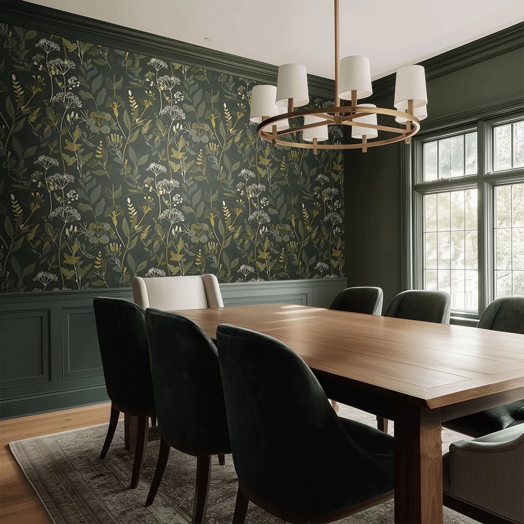
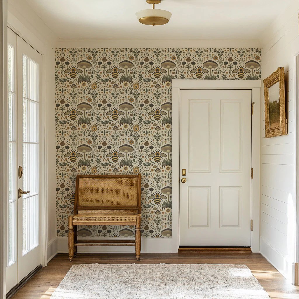
    Painted Paper’s Mattie Wallpaper — organic botanical shapes on a warm ground — creates exactly the kind of nature-immersive quality that mountain interiors seek. Lemon Park’s Alta, with its wintry mountain landscape pattern, is more narrative and directly references the alpine aesthetic for rooms that want to lean into that quality.

    The Finishing Layers

    Lighting: warm, low, layered. Floor lamps rather than overhead, table lamps on side tables, candles where possible. Mountain interiors should feel like firelight.

    Textiles: layer aggressively. Wool throws, sheepskin, chunky knit blankets, a high-pile area rug in a warm neutral. The tactile richness is inseparable from the aesthetic.

    Plants: one or two substantial plants — a fiddle leaf fig, an olive tree, a large monstera — rather than a collection of small ones.

    Books and objects: the collected quality of a mountain room depends on visible history. Books stacked horizontally as well as vertically. A basket with extra wood or extra throws. Objects with visible craft.

  • How to Create a Dark Moody Bedroom (Without It Feeling Like a Cave)

    The dark moody bedroom has become one of the most coveted aesthetics in residential design — and one of the most feared. People want the atmosphere: the depth, the warmth, the sense of stepping into somewhere enveloping and deliberate. What they worry about is the reality: a room that feels oppressive, closed-in, or simply too dark to function.

    The fear is understandable and mostly unfounded. Done correctly, a dark bedroom doesn’t lose light — it transforms it. Here’s how.

    Why Dark Works in Bedrooms Specifically

    The bedroom is the one room where darkness is a legitimate functional goal. You sleep in it. The absence of light is not a failure condition — it’s the point.

    Beyond function, dark walls in a bedroom create something that light walls can’t: the sense of enclosure that makes rest feel genuine. A bedroom with deep walls wraps around you. It signals that you’ve arrived somewhere separate from the rest of your life. Designers describe moody darker interiors as acting as a refuge from everyday overstimulation — spaces that feel like a retreat when paired with warm lighting and natural textures.

    The critical condition: warmth. A dark bedroom done in cool tones — gray-black, blue-black, cold navy — can feel cold and heavy. A dark bedroom done in warm tones — deep forest green, chocolate brown, warm burgundy, dusty slate — feels enveloping rather than oppressive. The temperature of the dark matters as much as the darkness itself.

    Choosing the Right Dark Color

    Deep forest or bottle green is the most forgiving dark color for bedrooms. It reads warm and organic rather than stark, responds beautifully to both natural and artificial light, and pairs naturally with wood, brass, and linen — the materials that warm a dark room best.

    Rich burgundy or wine creates the most dramatic effect but requires the most careful execution. It’s warm and enveloping at its best, potentially overwhelming at its worst. Works best in larger bedrooms with good natural light.

    Chocolate or espresso brown is the most underused option and frequently the most beautiful. It reads as warm from the first moment and feels genuinely cozy rather than theatrical. The 2026 color direction — Benjamin Moore’s Silhouette, a rich espresso brown, as Color of the Year — confirms this.

    Deep, dusty navy or slate works in bedrooms that receive morning light and want a more restrained version of the moody effect. The key is choosing a navy with warm rather than cool undertones.

    What to avoid: pure black (removes warmth entirely), cool charcoal (cold and flat), blue-grays without warm undertones (feel clinical rather than atmospheric).

    Wallpaper as an Alternative to Paint

    For bedrooms where dark paint feels like too large a commitment, dark-ground wallpaper provides the same depth and atmosphere with more complexity and visual interest — and in peel-and-stick formats, considerably less permanence.

    The advantage of dark botanical wallpaper over dark paint is that the pattern does additional work: it creates movement and detail that a flat dark wall can’t, and the botanical subject matter adds organic warmth that pure color doesn’t.

    Painted Paper’s Odette Arboretum — a metallic woodland botanical in black, dark bronze, and gold — is one of the most effective options for the moody bedroom treatment. Under warm lamplight the metallic elements in the pattern come alive in a way that rewards looking from close range, which is exactly the condition of a bedroom.

    For a warmer, slightly less stark version: Lillia Wallpaper brings the same depth with an underlying warmth that suits bedrooms that want atmosphere without coldness.

    Lighting: The Non-Negotiable

    This is where dark bedrooms most commonly fail. A single overhead fixture in a dark room creates a harsh, flat light that makes the walls feel heavy rather than atmospheric. Overhead lighting in a dark bedroom should be used only for task purposes — getting dressed, cleaning — and almost never in the evening.

    The lighting that makes a dark bedroom work: multiple sources at low heights, all warm-toned, all dimmable or switchable independently.

    Bedside lamps with warm-toned bulbs (2700K maximum) are essential. A floor lamp in a corner adds warmth without overhead harshness. Candles — real ones, used regularly — add the flickering quality that makes dark rooms feel alive rather than static.

    The rule: in a dark bedroom, you should never be sitting in the room in the evening with overhead lighting on. The lamps do the work. The overhead fixture is for daytime tasks only.

    Textiles: Keep Them Warm and Layered

    Dark walls require equally warm textiles to prevent the room from reading as cold. Cream and ivory linen, camel and warm tan wool, soft terracotta accents. The bedding should be warm in tone — not white-white, not cool gray — because cool textiles against dark walls create a contrast that reads as cold rather than sophisticated.

    Layering matters more in dark bedrooms than in light ones. The visual warmth created by multiple textures — linen, velvet, wool, woven cotton — compensates for the light the walls are absorbing.

    The Ceiling Question

    The default move is to leave the ceiling light while darkening the walls. This creates a visual interruption — the eye notices the shift from dark wall to light ceiling, which can make the room feel lower rather than more enveloping.

    The most dramatic and most resolved option: drench the ceiling in the same dark tone as the walls, or use the same dark wallpaper on all five surfaces. The room becomes a complete environment rather than a dark-walled box with a white lid.

    For those not ready to commit to ceiling drenching: paint the ceiling one or two shades lighter than the walls in the same color family. Deep forest green on the walls, soft sage on the ceiling — the connection reads and the ceiling doesn’t feel disconnected.

    What Makes It Work

    A dark moody bedroom that succeeds has three qualities: warmth in the color, layering in the light, and enough textile texture to absorb and redistribute the warmth rather than letting it disappear into the walls.

    Get those three things right and the dark bedroom stops feeling like a design risk and starts feeling like the room you most want to be in. Which is, after all, the point of a bedroom.

  • Grandmillennial Bedroom Ideas: How to Do the Aesthetic Without It Looking Like a Time Capsule

    The grandmillennial aesthetic arrived as a correction. After years of bedrooms stripped to their least interesting elements — white walls, matching nightstands, a single abstract print above the bed — people started looking at their grandmother’s house and noticing it had something their carefully curated apartment didn’t: soul.

    The term is inexact but the feeling is precise. Grandmillennial interiors are warm, pattern-forward, slightly cluttered in a deliberate way, full of things that have history. Florals that don’t apologize. Embroidered pillows. Cane furniture. Lamps that feel like they’ve been somewhere. Wallpaper as a foundational choice rather than an afterthought.

    The risk — and it’s a real one — is that executing this aesthetic without editing produces a room that looks like a set rather than a home. Here’s how to avoid that.

    What Defines a Grandmillennial Bedroom

    The grandmillennial bedroom is built on three qualities that genuinely set it apart from other maximalist aesthetics:

    Pattern confidence. Not one pattern, not a cautious floral on a single cushion. Multiple patterns in conversation with each other — typically a dominant wallpaper or textile, a secondary pattern on the bedding, and an accent pattern in the rug or curtains. The patterns share a palette but don’t match.

    Collected objects. Vintage frames, ceramic lamps with interesting bases, small botanical prints, a tray of perfume bottles, a stack of books with beautiful spines. Nothing is there to fill space. Everything has been chosen, found, or inherited.

    Warm materiality. Linen that’s soft from use. Embroidered details. Cane and rattan. Brass that’s developing patina. Wood that’s been around long enough to have character. The opposite of sleek.

    The Wallpaper Foundation

    In a grandmillennial bedroom, the wallpaper is where the room begins. It’s not the last decision — it’s the first. Everything else responds to it.

    The patterns that work best in this aesthetic: large-scale botanicals with dark grounds (forest scenes, dense florals, moody garden prints), chinoiserie, traditional florals with enough scale to feel bold rather than fussy, and heritage-style patterns that reference the history of the wallpaper craft.

    Painted Paper’s June Blossom — creamy white florals and wispy greenery on a lush teal ground — is one of the most effective options for this application. The illustrated quality gives it the handcrafted feel the aesthetic requires, and the teal background creates depth and richness while the cream florals keep it from reading as heavy or stark.


    For a lighter take: Painted Paper’s Oleander — detailed illustrations of bees, mushrooms, and wildflowers in warm earthy tones on a cream ground — creates the grandmillennial quality without the drama of a dark ground. The pattern has genuine complexity and rewards close inspection, but the warm cream background keeps it airy rather than heavy — better for smaller rooms, rooms with limited natural light, or bedrooms where you want character without enclosure.

    The Bedding Layer

    Grandmillennial bedding is layered and tactile. The combination that works: a neutral linen duvet as the base (this is the room’s breathing space), embroidered or floral pillowcases, at least one large floral or tapestry-style cushion, and a quilt or patterned throw folded at the foot.

    The floral elements in the bedding should share at least one color with the wallpaper. They don’t need to match — the connection can be a single recurring tone, like warm amber in the wallpaper and warm ivory in the embroidered pillowcase.

    Avoid: bedding sets purchased together. The grandmillennial aesthetic lives or dies by the sense that things were found at different times from different places.

    The Furniture Mix

    The furniture in a grandmillennial bedroom should look like it was assembled over time from different sources and different eras. A cane headboard or a simple wood frame sits better than a tufted upholstered piece. A vintage dresser with a slightly mismatched mirror. Nightstands that don’t match each other but share a similar warmth.

    Cane and rattan furniture is particularly strong in this aesthetic — it references the exact design era the grandmillennial look draws from (1960s–70s) while being light enough not to visually overwhelm a room already rich with pattern.

    The Object Layer

    This is where the grandmillennial bedroom earns its distinctiveness. The objects on the dresser, the bedside table, the windowsill: a ceramic lamp with an interesting base (estate sales are the best source), a small framed botanical print, a tray with perfume bottles, a small vase with dried flowers or a single stem.

    Each object should be able to answer the question: where did this come from? Objects with no answer to that question — purchased generically, chosen for approximate fit — undermine the aesthetic. The grandmillennial bedroom is legible as belonging to a specific person. Generic objects work against that.

    Lighting

    Warm, layered, and slightly theatrical. Bedside lamps with ceramic bases and fabric shades (drum shades in a neutral linen or a small pleated shade) work better than contemporary metal fixtures. A chandelier or pendant with visual interest over the bed or in the center of the room. No LED strip lighting, no spotlights, nothing that reads as modern and functional.

    The goal is lamplight that makes the patterns on the walls and the textures in the bedding glow. Grandmillennial bedrooms are at their best at night, which is when most bedrooms are used. Design for that light.

    The Edit That Prevents Costume

    The grandmillennial aesthetic goes wrong when it becomes literal — every surface covered, no hierarchy, no breathing room. The rooms that work in this aesthetic have edited as carefully as they’ve added.

    The discipline: remove anything that doesn’t have genuine warmth, history, or character. Remove the decorative objects that are present because they filled a gap. Remove the extra cushions that are providing bulk without personality. What’s left should be a room that’s full but not crowded, warm but not cloying, patterned but not overwhelming.

    The test: if you removed the person who lives there, would you still be able to tell something about them from the room? In a grandmillennial bedroom done well, the answer is yes.

  • Where to Find Vintage Brass Hardware That Doesn’t Cost a Fortune

    Brass hardware is the single detail that most quietly elevates a room. It works in almost every aesthetic — warm neutrals, dark moody interiors, white kitchens, collected eclectic spaces — because the warmth of the metal responds to the light around it rather than competing with it. And unlike most design upgrades, swapping cabinet hardware requires no contractor, no drywall, and about twenty minutes per cabinet.

    The difference between new polished brass (too shiny, too perfect) and antique or unlacquered brass (warm, dimensional, develops patina over time) is significant. Here’s where to find the second kind, at every price point.

    Why Unlacquered and Antique Brass

    Unlacquered brass changes over time — it develops a patina that makes it look like it’s always been there. Lacquered brass stays fixed at whatever finish it left the factory with. For a home that’s meant to look gathered and lived-in, unlacquered is almost always the right choice.

    Antique brass has already been given that aged quality through finishing. It tends to read warmer and more complex than bright brass, and it photographs beautifully.

    The Edit

    BEST FOR AUTHENTIC AGED PIECES: House of Antique Hardware
    Hand-finished solid brass in genuinely aged patinas that continue to develop over time. Their Antique-By-Hand line is cast from vintage originals and finished with a living patina — meaning it’s not lacquered and will deepen with use. The tapered bin pulls and round knobs with rosettes are particularly strong.

    Pair of Solid Brass Left-Hand Flag Hinges in Antique-By-Hand – 3 1/4″ x 1 3/4″

    BEST FOR ITALIAN-MADE QUALITY: Forge Hardware Studio
    Made in Italy, with a warm champagne bronze and antique brass finish that has become a go-to recommendation among design bloggers. Heavy and solid in the hand. The round knob and cup pull pair particularly well together.

    Round “Capri” Antique Brass Cabinet Knob

    BEST BRITISH SELECTION: Plank Hardware
    Clean
    , considered antique brass hardware with knurled texture options that add grip and detail. Their BOBBIN D-Bar Pull
    is a strong choice for kitchens that want something slightly more refined than a plain round knob.

    BOBBIN D-Bar Pull

    BEST WIDE SELECTION: Knobs.co
    One of the most comprehensive online sources for brass hardware at multiple price points. Good for projects where you need consistent hardware across a large number of cabinets and want to compare styles side-by-side before committing.

    Traditional Appliance Pull, Antique Brass, 15” cc 738-AB

    BEST FOR BUDGET PROJECTS: Wayfair Antique Brass Cabinet Pulls
    A wide range of antique brass options at accessible prices. Quality varies, so read reviews carefully and look for options described as solid brass rather than brass-plated zinc. Good for rental upgrades or rooms where you want the look without significant investment.

    Center to Center Cup Pull Multipack (Set of 6)

    BEST FOR HUNTING ORIGINALS: eBay and Etsy
    For genuinely vintage brass hardware — pieces with real history and patina — eBay and Etsy are the most reliable sources. Search terms: “vintage brass cup pulls,” “antique brass bin pulls,” “solid brass cabinet hardware vintage.” Buy in quantities slightly larger than you need in case of variations between lots.

    The Installation Note

    Most cabinet hardware uses standard screw spacing. Before ordering, measure the center-to-center distance on your existing pulls (typically 3 inches, 3.75 inches, or 5 inches for pulls; knobs use a single hole). Replacing like-for-like spacing means no drilling. Changing spacing means filling old holes and drilling new ones — manageable as a DIY project, but worth planning for before you order.

  • How to Create a Gallery Wall That Looks Like It Wasn’t Trying

    A gallery wall is one of the most personal design statements a room can make. Done well, it reads as a reflection of the person who lives there — layered, idiosyncratic, collected over time. Done poorly, it reads as a collection of frames arranged by someone who couldn’t commit to a single piece.

    The difference is process. Here’s how to do it properly.

    Step 1: Choose Your Wall

    Not every wall is a gallery wall candidate. The best gallery walls are on walls you see from a seated position — the wall the sofa backs up to, the wall opposite the dining table, the wall at the end of a hallway. Walls that you pass by without pausing get less visual attention than the ones you sit and look at.

    The wall should be relatively uninterrupted — minimal doors, windows, or switches breaking the surface. A clean, large wall gives the arrangement room to breathe. A wall crowded with architecture competing for attention makes the gallery look cluttered even before you hang anything.

    Step 2: Define the Boundary

    Before choosing a single piece, decide the outer boundaries of the arrangement: how wide, how tall, how far from the ceiling, from the floor, from adjacent walls. This decision shapes everything that follows.

    A useful rule: the outer boundary of the arrangement should be roughly proportional to the wall — approximately two-thirds the width of the wall, with the center of the arrangement at approximately 57–60 inches from the floor (standard gallery height).

    Mark the boundary corners lightly on the wall with pencil, or use painter’s tape to outline the arrangement’s footprint. This gives you a container to work within and prevents the arrangement from growing asymmetrically as you hang.

    Step 3: Choose Your Anchor Piece

    Every successful gallery wall has an anchor — a piece significantly larger than the others that establishes the arrangement’s visual center of gravity. The anchor is typically positioned near but not exactly at the center of the arrangement, offset slightly to one side or above the midpoint.

    The anchor should be the strongest piece in the arrangement: the one you’d keep if you could only keep one. Everything else is built around it.

    Step 4: Mix What You’re Putting In

    The arrangements that work well contain a mix: framed art prints and framed photos, but also objects — a small mirror, a ceramic wall-mounted piece, a textile hanging, a small shelf with one thing on it. This material variation is what prevents a gallery wall from looking like a frame display and makes it look like a collection.

    A reliable mix: three to five framed pieces (art prints, photographs, or a combination), one mirror, one or two non-framed elements (a woven piece, a ceramic, a mounted object). The non-framed elements provide material contrast that makes the framed pieces look more intentional.

    Step 5: Work It Out on the Floor First

    Before touching the wall, arrange everything on the floor in the approximate footprint of your boundary. Move pieces around until the arrangement feels balanced — not symmetrical, but balanced. Large pieces distributed, variety in frame size across the arrangement, the anchor piece positioned where it will be strongest.

    Photograph the floor arrangement from above. This is your reference when you hang.

    Step 6: Frame Consistently, Vary the Content

    The most common gallery wall mistake is using too many different frame styles and colors. A mix of gold, black, wood, and white frames reads as chaotic. Choose one or two frame finishes — one primary (black, brass, or natural wood are the most versatile) and one secondary — and stick to them across the arrangement.

    The variation should come from the art, not the frames. Consistent framing makes the art feel curated; inconsistent framing makes it feel like miscellaneous frames found at different times.

    Step 7: Hang from the Anchor Out

    Start with the anchor piece, hang it exactly where you want it, and work outward from there. Don’t start from a corner and work across — the arrangement will drift in that direction and the visual balance will be off.

    After the anchor, add the next largest piece, then work outward with progressively smaller pieces. Maintain 2–3 inches of space between frames — enough to read each piece individually, close enough to read as a single arrangement.

    Practical Hanging Tips

    Paper templates. Trace each frame onto paper, cut out the template, and tape the templates to the wall before drilling. This lets you see the full arrangement in place before making any holes. Adjust until it’s right, then drill through the paper.

    Level is optional. Gallery walls with every frame perfectly level look corporate. Gallery walls where most frames are level but a few are slightly off look collected. Choose your preference intentionally rather than accidentally.

    Command strips for small frames. 3M Command picture strips rated for the frame weight remove cleanly from most wall surfaces. For heavier frames and mirrors, find studs.

    The Edit After Hanging

    Once everything is up, live with it for a week before deciding it’s done. The pieces that bother you after a week probably need to be replaced or removed. The ones you’re still happy with after a week are right.

    A gallery wall isn’t finished when you hang the last frame. It’s finished when the combination feels genuinely like yours.

  • The $200 Bathroom Refresh That Feels Like a Renovation

    A full bathroom renovation costs between $5,000 and $25,000 and takes weeks. A thoughtful refresh costs under $200 and takes a weekend. The gap in visual impact between these two outcomes is smaller than most people think, because the elements that make a bathroom feel dated or uninspired are almost always the same ones: the hardware, the lighting, the mirror, and the walls. All of them are changeable without demolition.

    Here’s the framework, in order of impact per dollar.

    Step 1: The Hardware — $30–60

    Cabinet hardware is the fastest and highest-return change in any bathroom. New pulls and knobs on a dated vanity immediately update the whole piece without replacing it. Antique brass or brushed nickel in a warm tone are the finishes that hold longest.

    Plank Hardware — Antique Brass Knurled Knobs

    Clean, solid, warm-toned. A set of six knobs typically covers a standard single-sink vanity.

    Price: ~$8–15 per knob

    Wayfair — Antique Brass Bar Pulls
    For vanity drawers, a 3-inch or 3.75-inch bar pull in antique brass reads more sophisticated than a basic knob. Multiple options in the $4–10 per pull range.

    Price: ~$4–10 per pull

    Step 2: The Wall — $40–80

    A single wall of wallpaper in a bathroom transforms the room more dramatically than paint at any price. Powder rooms and bathrooms are the ideal candidate for bolder choices — the small square footage limits commitment while maximizing impact.

    Painted Paper — Organic Botanicals, Pre-Pasted or Peel-and-Stick
    USA-made, PVC-free, with options that work in bathrooms. One roll typically covers a small accent wall.

    Price: ~$129–$169 per roll

    Tempaper — Peel-and-Stick Grasscloth and Pattern Options
    Strong range of moisture-tolerant options that install and remove without damage. A good choice for rental bathrooms.

    Price: ~$55–85 per roll

    If wallpaper isn’t the direction, a single bold paint color on all four walls — deep green, rich navy, warm terracotta — does similar work at lower cost.

    Benjamin Moore Aura Bath & Spa is worth the premium for humid environments.

    Step 3: The Mirror — $40–90 (if needed)

    A dated or builder-grade mirror is one of the most common reasons bathrooms look unfinished. An arched, round, or architectural-framed mirror updates the space immediately. Look at Amazon, Wayfair, and Target before committing to higher price points — the range at $40–80 is genuinely strong.

    Amazon — Arched or Round Mirror Options
    Search: “arch mirror bathroom gold” or “round mirror bathroom 24 inch.” Significant range at $40–90. Read reviews for mounting hardware and finish quality.
    https://www.amazon.com/s?k=arched+mirror+bathroom+gold
    Price: ~$40–90

    Target — Threshold Studio McGee Mirror Collection
    Consistently strong bathroom mirrors at accessible prices. The Antique Gold Arch Mirror and similar styles in the Studio McGee collection are particularly well-regarded.
    https://www.target.com/s?searchTerm=bathroom+mirror+arch+gold
    Price: ~$45–80

    Step 4: The Accessories — $20–40

    The final layer: a new hand soap dispenser, a simple tray or dish for the counter, rolled towels in a basket, and fresh white towels. These cost almost nothing and shift the perception of everything else in the room.

    Amazon — Antique Brass Soap Dispenser
    A ceramic or glass soap dispenser with a brass pump reads significantly more finished than the plastic dispenser that came with the house.
    https://www.amazon.com/s?k=antique+brass+soap+dispenser+ceramic
    Price: ~$15–25

    Small woven basket for rolled towels (see The Basket Edit for options): ~$15–25

    The Total

    Hardware: ~$40
    Wallpaper or paint: ~$60–80
    Mirror (if needed): ~$60
    Accessories: ~$30
    Total: ~$190–210

    The bathroom doesn’t need to be gutted to feel transformed. It needs its details attended to. These four changes — hardware, walls, mirror, accessories — address the elements that make bathrooms look dated, and they do it in a weekend.